Ethan
USER EXPERIENCE – VISUAL DESIGN APP
Ethan is a community for all creative and fashionable people. This application references the most relevant European Designers.

MAIN INTERFACE
About the project
Who is Ethan? He is your best friend who knows all the fancy boutiques nearby you. I created that personal project when I was doing my user experience training.
The aim of the application is to enhance a large visibility of creators, boutiques, craftsmen, and designers. That geolocation app helps the users to find the fashion and design shops.
That community of creative people allows the users to create an account for communicating and sharing their creations, locations, and events.
ROLE
Art direction
UX Desgin
UI Design
PLATFORM
IOS
Android
YEAR
2017

MAP VIEWS
Ux Challenge
At the end of my training, we had to create a personal project from scratch within 3 weeks. The project might be a website or an app which didn't exist yet on the market. The real challenge was not really to find the idea but to achieve a coherent project in this time scale.
To save time and structure my ideas I drew a kind of hierarchy, with the most important functionalities and categories. My first draft gave me a good overview. Once my ideas were more or less clear, I defined the five major functionalities.
That five options were my starting point and so the main menu for the user. So I divided the app into 5 sections displayed in a fixed bottom bar menu; Localization - List of designer - add an unknown place - events - profile. When my menu was clear I used a sitemap to visualize branches and interactions related with each categories.

SITEMAP
To achieve the ideal breadcrumbs, I came up with three fictional characters: personas. The user type represents the potential future users who might use the app.
The user type may be product designer, art professor, graphic designer, fashion designer, and tourist guide. Actually, every person who has a strong interest in design, creation, and fashion products.

PERSONA
Ux solutions
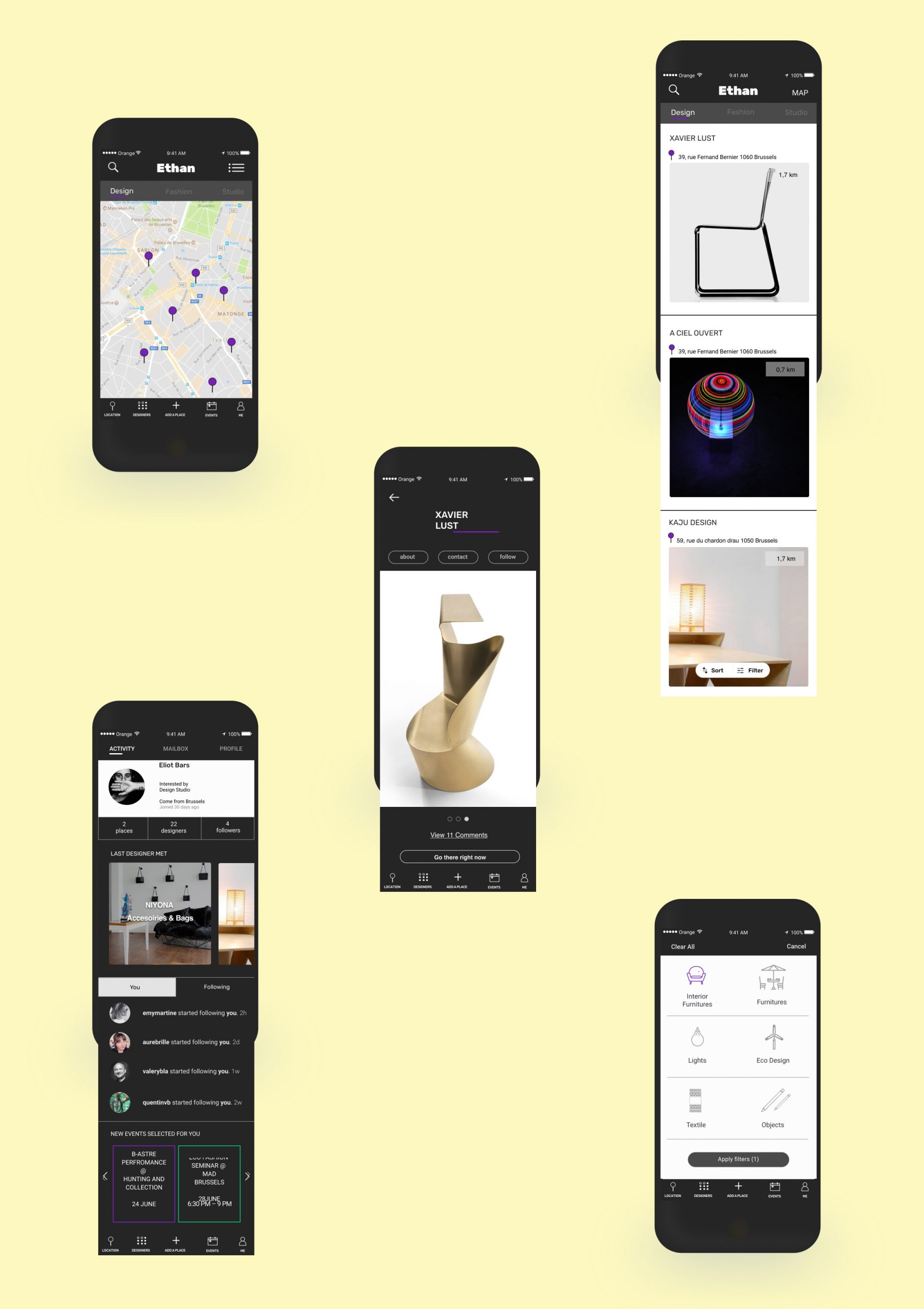
First, I designed some wireframes to solve the user experience process around the main functionality; the map. Geolocation is the main interaction between the app and the user. The map suggests three categories to filter your research: Design – Fashion - Studio.
Design
Collect all the creations within the product design sector. Such as furniture, objects, textiles, lights, and sustainable products.
Fashion
Collect all fashion creations for men and women such as clothes, accessories, shoes, bags, underwear, and jewelry.
Studio
Collect all the freelancers who don't have a boutique within the sectors; graphic, textile, photography, video, sounds.
After the categories defined, I was reflecting on the brand profile.
Each profile has his personal details; logo - name - address - distance - product images - more info.


Design challenge
To evoke the look and feel of Ethan. I selected a series of ui elements; colors, typography, mobile interface, interactions. To keep in mind the style chosen, I regrouped the elements into a UI moodboard. It's was an effective way to stay focus on that look&feel and don't lose time with other wonderful elements. Every time that my creative brain wanted to get lost into a new style I visualized the moodboard.

MOODBOARD
The essential elements of the visual design were the typography, colors, and icons set. So, I found an impact typography for the logo, I wanted to have something very strong. Because I knew that my color palette couldn't be very large because of the lack of time.

TYPOGRAPHY
The choice of sans serif fonts was to facilitate the readability and allow a more natural reading rhythm. Roboto is a neo-grotesque sans-serif which matches perfectly with a strong font with slightly rounded corners as Rubik typeface. The choice of Helvetica for the text was obvious because it works so well. The typefaces support the reading process on mobile, that clear communication is the primary goal of those typographies.

COLOR PALETTE
To display a minimalist style, I designed the interface in black and white. To emphasize the three categories, I chose three powerful colors. In that way the users know in which sector their research is. Violet for design - green for fashion - yellow for Studio.

ICONS
To remain in a minimalist style, I strove to find the best minimalist icon for each interaction and filter. I designed some icons but most of them come up from an icon set already designed to increase the ui productivity.
LAYOUT FINAL
Design solutions
The primary interface screen is a map, but the user has also the choice to switch into a list view. Pushing on name or image sends the user to the brand profile, where he can read more information about product & brand. The filter is a permanent button on the list view to help the user to narrow his research by product. The account interface is a profile screen where the user can follow the brand and the events.
The challenge to work under time pressure forced me to stay focus on the essential. The ux process development learnt me to work step by step to figure out the missing elements of interactions. To present the project to the jury, I created an interactive prototype. The interactive prototype shows exactly the user interaction, it's a powerful tool to rectify a thousand details that seem not so important into the wireframe. Everything is different in an interactive design. I choose, do not display the prototype, and keep it secret because maybe one day Ethan will be alive. I am proud of what I accomplished in only three weeks even if all screens are not perfect. But as Winston Churchill said, " The perfection is the enemy of progress".