ScaleUP
DESIGN SYSTEM - DESKTOP APP
Build a consistent design language was essential for sharing to 150 team players across Europe. Based on material design, the developers teams are using internally the design system for coding ScaleUP.
STYLE GUIDE
About the project
ScaleUP is an internal virtual factory to handle the production line, production schedule, task management, and customer complaints.
We based each design element on material design to keep in mind a unified system combining theory, resources, & tools. And for crafting experiences that synthesizes the classic principles of good design.
We were a team of 5 designers: 1 UX research - 1UX Architect - 3 UI Designer. For sharing our latest library sketch and be always up to date, we worked on Abstract.
ROLE
Art direction
UI Design
PLATFORM
Web
YEAR
2017-2019
TRANSPORT ICONS
Design Challenge
One of the major challenges was to arrange all the existing files, keeping the recent design and transferring the PSD files into Sketch. Highlighted the multiple interpretations of the existing design system and the missing foundation. Such as a proper grid, guidelines, text style, and color palette. The only reference was a material design sticker sheet.

STICKER SHEET
Design solutions
Priority
To solve the files selection, we ordered the elements/components by using the atomic design approach. Brad Frost took the natural world - the chemical reaction - to establish a method to craft interface design systems.
Atomic elements combine together to form molecules. These molecules can combine further to form complex organisms. Afterward, the organisms are implemented into a layout.
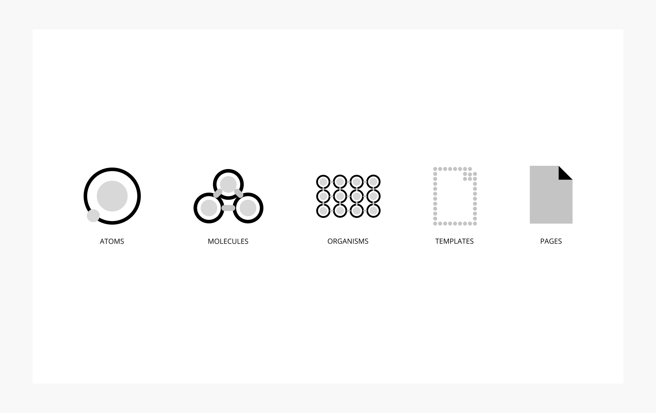
ATOMIC DESIGN
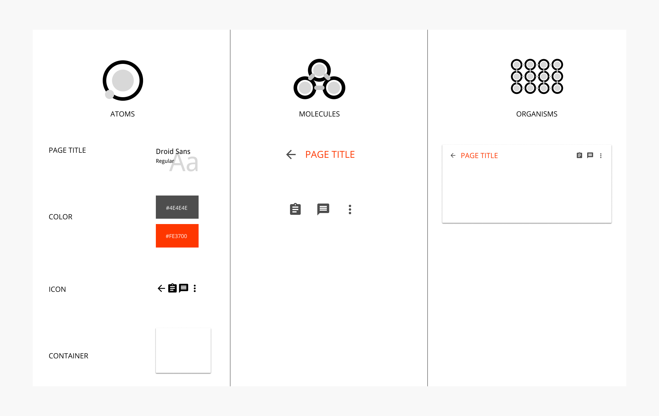
Here is an example of how we designed the toolbar used inside the content canvas like a secondary navigation. As organisms, the toolbar comprises a heading and action icons buttons.
The desktop template contains a permanent app bar in the header and a side navigation menu. The content canvas can have their own secondary toolbars for tabs or secondary actions.

Consistency
Creating a foundation was essential to provide a consistent set of design and guidelines. These guidelines define as well as the style guide and the user experience.
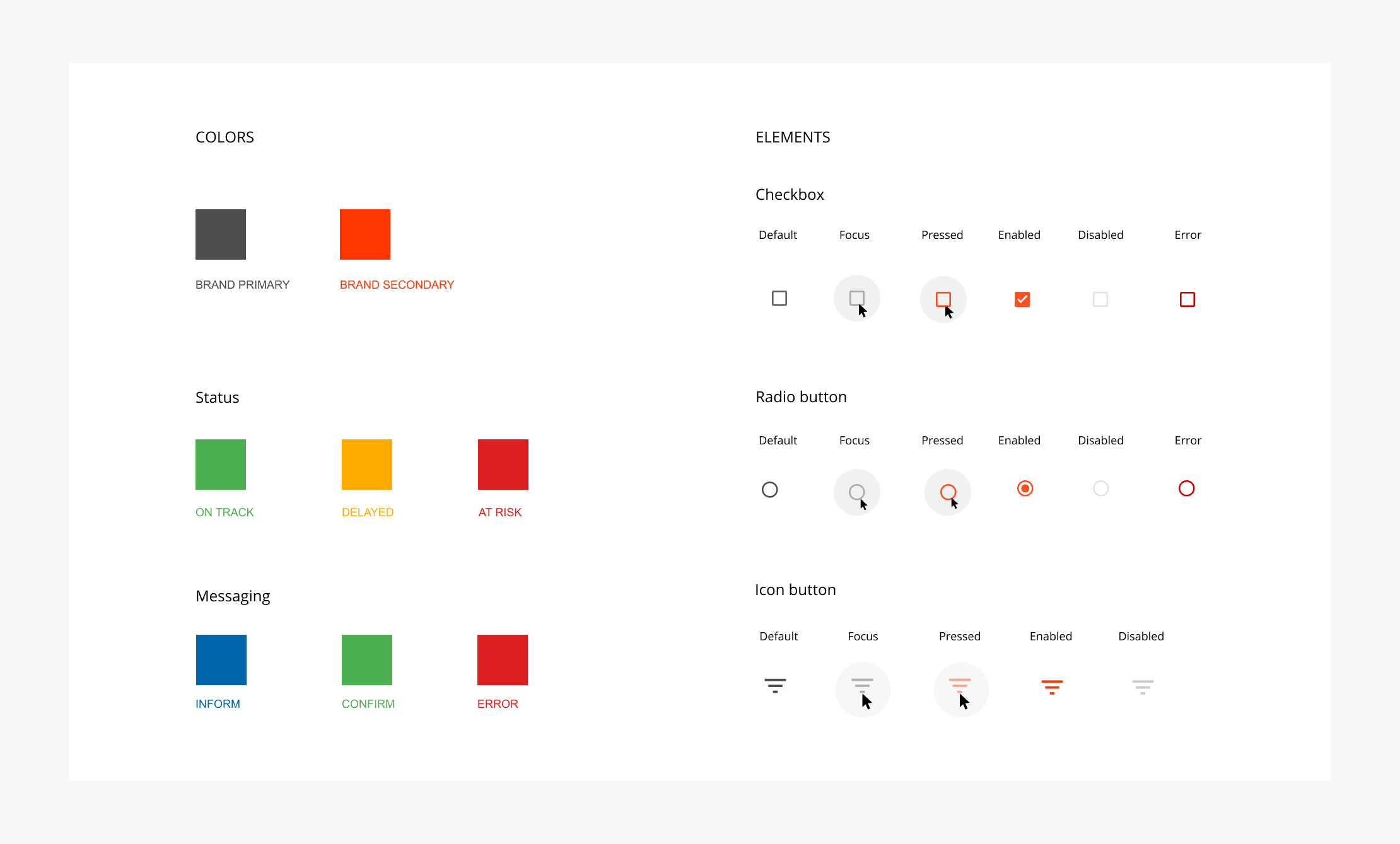
The style guide comprises the 'atoms' such as typography, color palette, buttons, icon library, card, grid, and shadow styles.

TYPOGRAPHY
The choice of two humanist sans serif fonts was to facilitate the readability and allow a more natural reading rhythm. This friendly set of typefaces optimizes the user interfaces on a mobile, web browser, and other screen text.
To emphasize the difference between title, subtitle, tabs, button, label, we played with the various font's weight.

TEXT STYLE
To enable a consistent look and feel across the application, we defined a color palette according to the meaning behind the various elements and components.
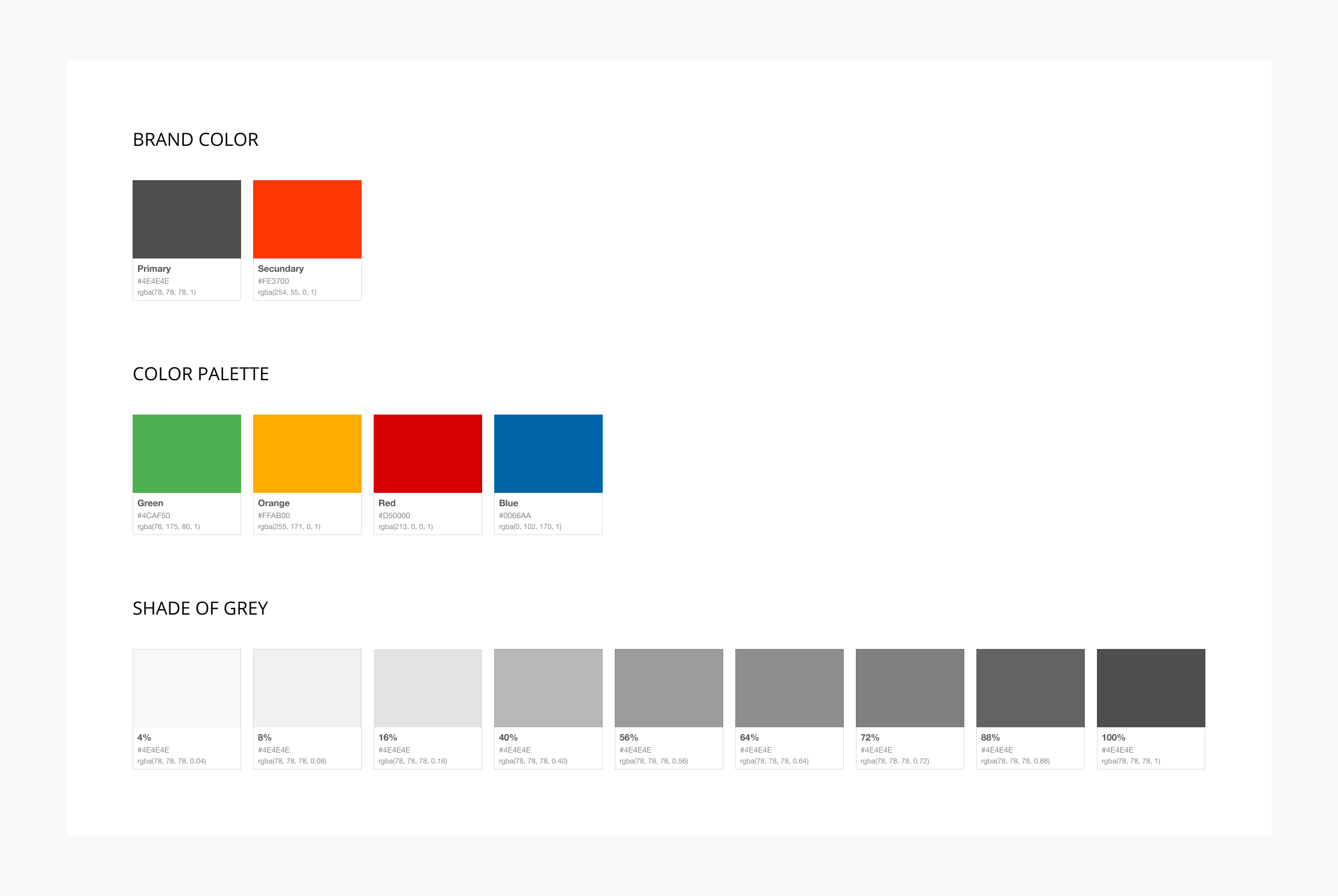
COLOR PALETTE
Efficiency
To increase ux productivity, we used flexible and powerful tools.
Every week we planned a design review to syncing up with the team and prioritize the essential design elements.
To avoid duplicate work and share code reuse, we used the library Sketch and export to Zeplin for the developer team.
The usage of the atoms and how they look like on interaction with the user interface was share when we agreed on each element.

TOOLS
Sketch for designing.
Axure for prototyping.
Abstract for versioning.
Zeplin for sharing design.
Miro for visual collaboration.
PROCESS
Story mapping.
Content templates.
Structured design reviews.
Conceptual data modeling.
PATTERN LIBRARY
Encourage reuse pattern.
Document what's already available.
Knowledge sharing and code reuse.
ICONS MEANING
Continuity
Accessible documentation contains different procedures, dedicated explanations, as well as a criteria list to ensure quality and continued discussion for both designers and developers.
To ensure mistakes in the past such as improper maintenance and prioritization are prevented, we provided rules within a clear reference for every designer and developer and project manager on the team.

DOCUMENTATION
By initializing the establishment of the collaborative process, through constant communication between the team, the ScaleUP design language allows team members to strengthen production quality.
The atomic design method allowed us to emphasize the importance of the terminology for each single element.
A design system affects a thousand interactions on the user interface. And it affects also the daily decisions of every team member. This project learned me how to communicate frequently and transparently, the strategic priorities, and updates to the best-suited people as possible.