
Actiris Job Seekers' Journey
The Actiris Job Seeker Journey is the central workspace used by job seekers and employment advisors to manage every stage of the employment journey.
ROLE
UX Research • UX/UI Design • Information Architecture • Workshops • Interactive Prototyping • Testing
PLATFORM
Responsive Web Application
INDUSTRY
Public Services
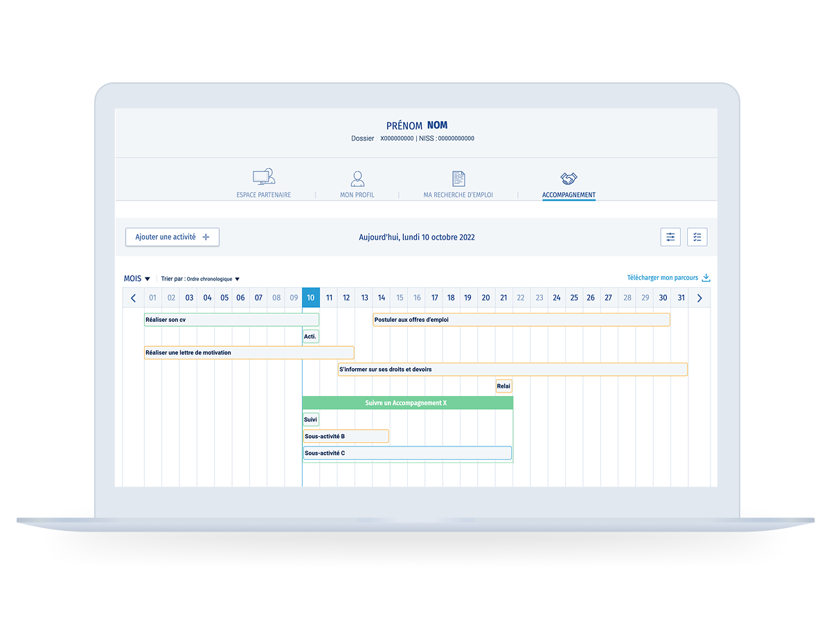
TIMELINE MONTH VIEW
Overview
Design Process
Redesigning a complex employment support platform into an intuitive timeline-based experience.
Actiris wanted to modernise its case management platform used by employment advisors and job seekers throughout the employment journey.
The goal was to simplify the follow-up process, improve visibility across every stage of the journey and create a more intuitive experience for advisors managing complex cases.
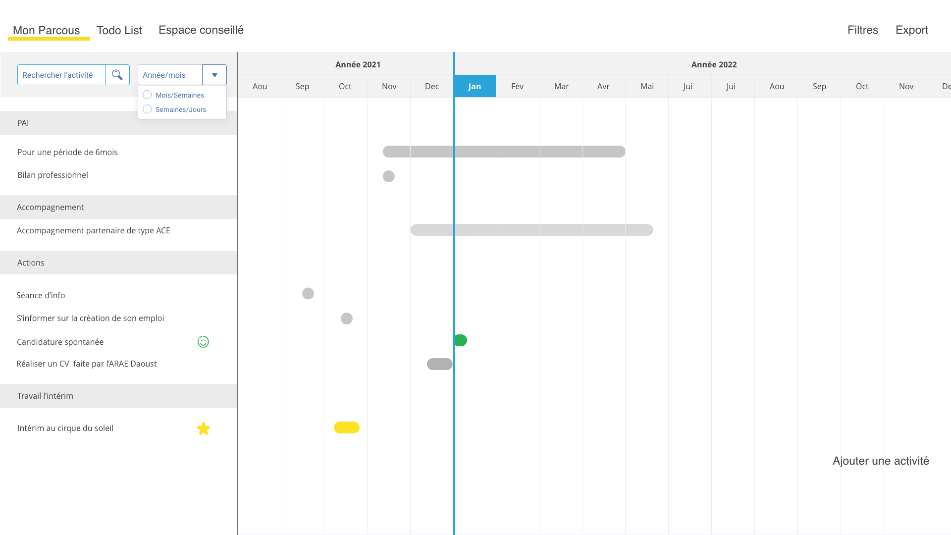
A key challenge was designing a timeline-based interface capable of presenting the entire employment journey at a glance, allowing advisors to quickly understand completed actions, upcoming milestones and the current status of each case.
I led the end-to-end UX/UI design process, from user research and co-design workshops to information architecture, wireframing, interactive prototyping and high-fidelity UI design.
Working closely with Business Analysts, Product Owners and developers, we translated complex business rules into intuitive user flows while ensuring the platform could support the different permissions, workflows and responsibilities of each user role.
Before designing the interfaces, we mapped key user scenarios, identified role-specific actions for both employment advisors and job seekers, and defined the navigation structure required to support the entire employment journey.
TIMELINE FLOW PROTOTYPE
The platform offers multiple timeline views, allowing users to switch between weekly and monthly planning while keeping the employment journey clear and easy to navigate.
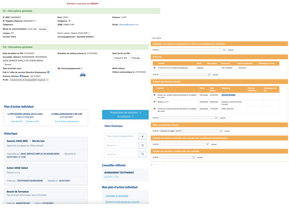
BEFORE REDESIGN
Challenge
The existing interface displayed the job seeker's information across multiple disconnected panels, tables and forms. The journey was a disconnected lists and information blocks, making it difficult for advisors to understand and identify completed actions or follow the overall progress of the employment journey.
The challenge was to transform this fragmented experience into a clear and intuitive workflow by reorganising information into a chronological overview.
Rather than simply reorganising existing screens, the objective was to design a new interaction model capable of supporting both advisors and job seekers throughout the entire employment journey.
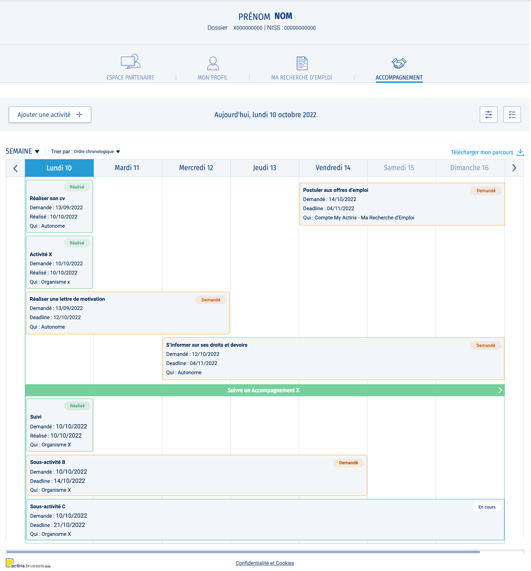
TIMELINE WEEK VIEW
Design Exploration
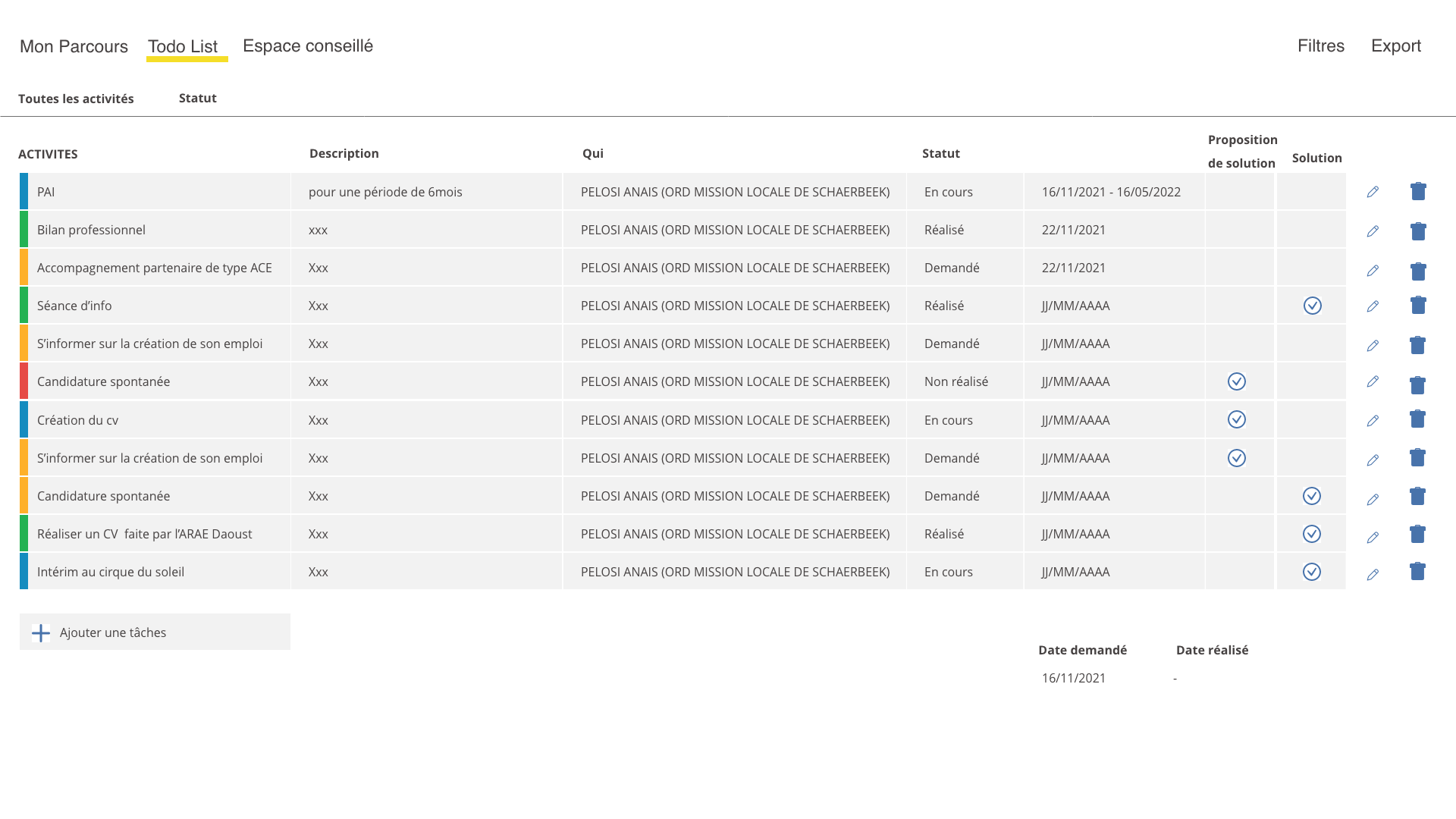
Early concepts explored a vertical timeline. Through several UX iterations and user feedback, the concept evolved into a horizontal timeline, providing a more natural representation of progression over time.
This exploration led to two complementary views:
Journey View, providing a chronological overview of the employment journey.
To-do View, allowing advisors to quickly identify pending actions and priorities.
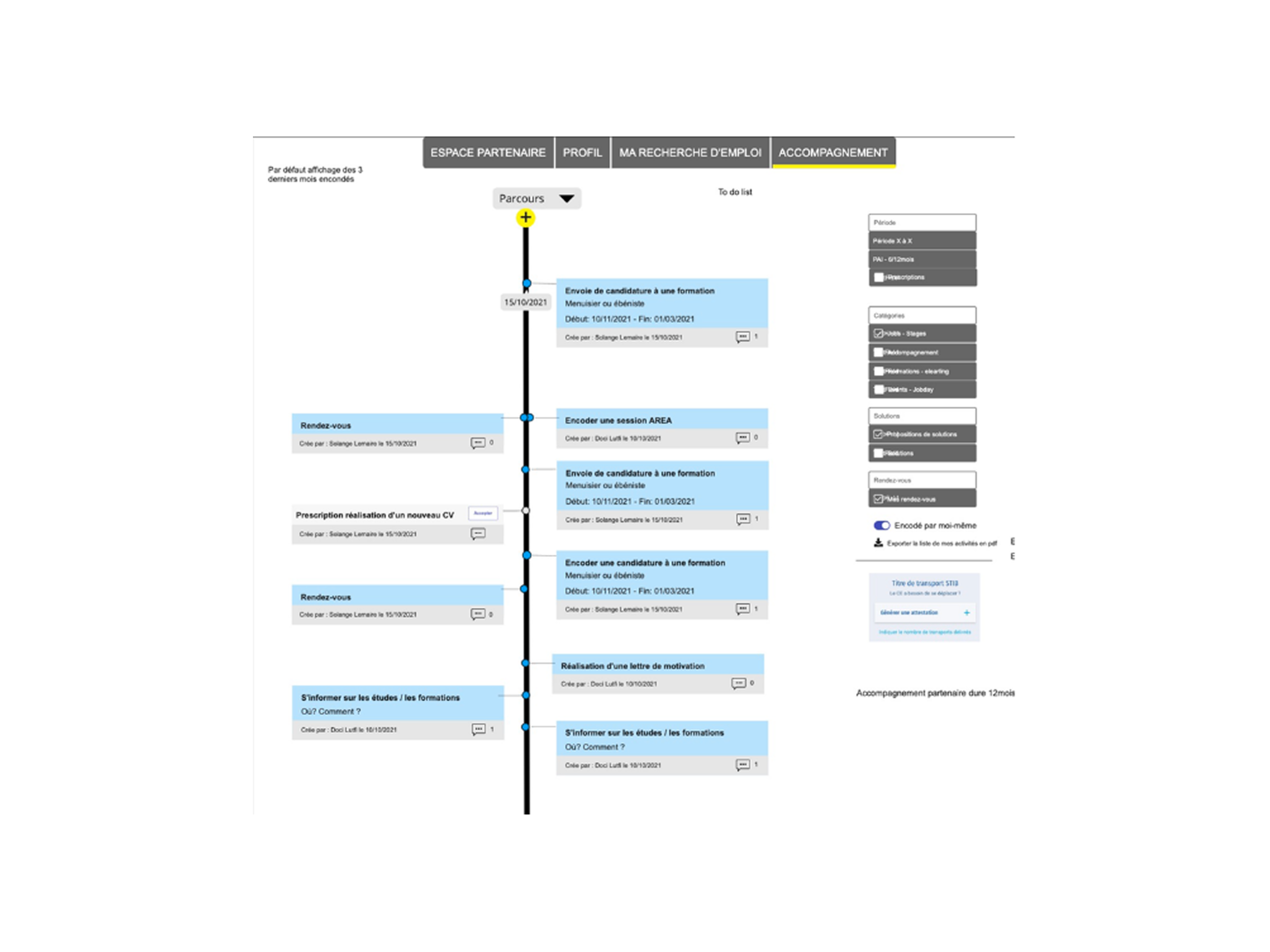
WIREFRAMES EXPLORATION
Responsive Timeline
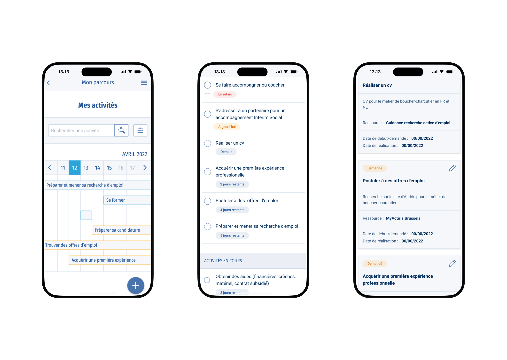
The timeline concept was also designed for mobile, giving job seekers access to their journey and pending activities while maintaining a consistent experience across platforms.
MOBILE VIEWS
Interactive Prototype
A high-fidelity interactive prototype was developed in Axure RP to validate the user experience before development.
It was used during usability testing and stakeholder workshops to refine navigation, interactions, and information hierarchy.
The prototype demonstrates the complete user flow, including switching between Journey and To-do views, navigating through day, week, month and year timelines, and managing activities throughout the employment journey.
ACTIVITY CREATION PROTOTYPE
Outcome
The project introduced a completely new way of visualising employment journeys. Instead of navigating through fragmented forms and scattered information, advisors gained a timeline-based workspace offering a clear overview of each case, upcoming actions and completed milestones.
The timeline became the core interaction pattern of the platform, enabling advisors to understand an entire employment journey at a glance while adapting the level of detail through multiple temporal views (day, week, month and year).
Activities could be created directly from both the Journey and To-do views, making task management faster and more flexible. A consistent colour-coded status system—completed, in progress, pending and overdue—made priorities immediately visible and helped advisors monitor each case more efficiently.
By replacing fragmented legacy screens with a unified timeline-based experience, the project established a scalable interaction model that simplified complex workflows while providing a consistent user experience across the platform.